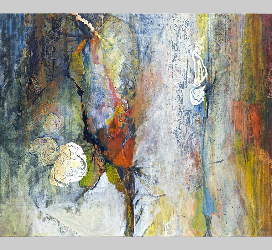
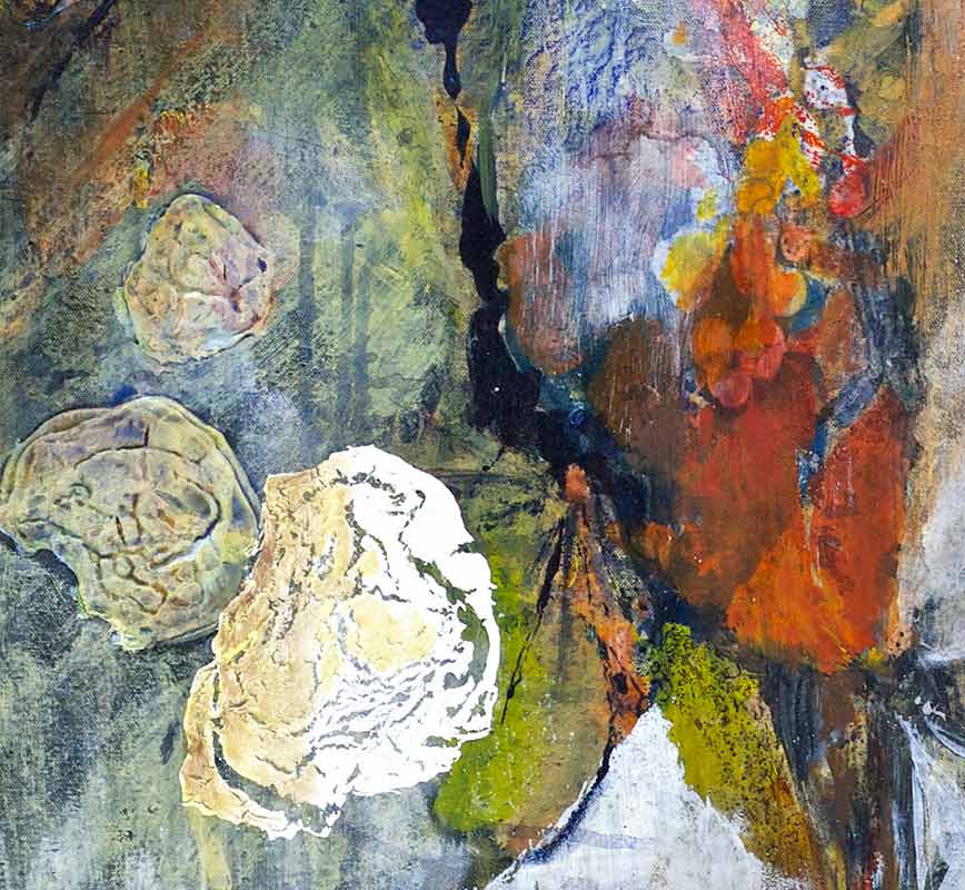
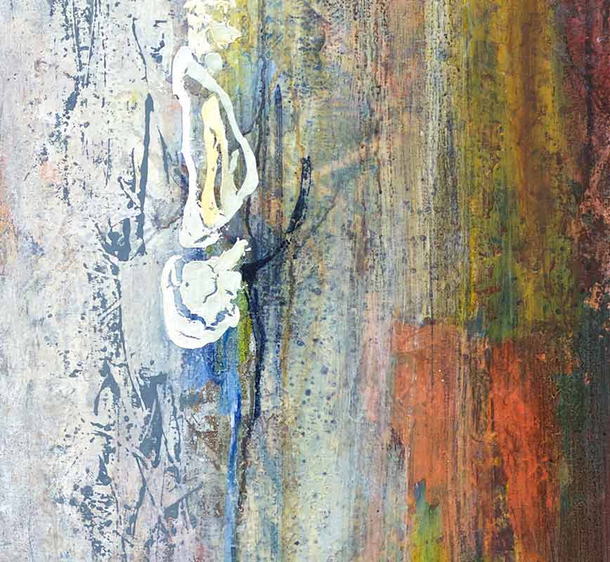
The palette in Friends in High Places is nearly without color: cream, gray, pale blue, with the paint built into large, almost sculptural masses in the lower and middle passages that read as forms hovering in an indeterminate white light. Against this restraint, the orange and black accents land with the sudden clarity of things that have broken free of their context: they are not decorative; they are specific, placed, intentional.
The palette in Friends in High Places is nearly without color: cream, gray, pale blue, with the paint built into large, almost sculptural masses in the lower and middle passages that read as forms hovering in an indeterminate white light. Against this restraint, the orange and black accents land with the sudden clarity of things that have broken free of their context: they are not decorative; they are specific, placed, intentional.
Friends in High Places shares a logic with Nicolas de Staël’s late paintings: impasto forms in high-key, near-colorless fields, chromatic events that carry disproportionate weight through placement rather than size. Petrov’s handling is more atmospheric, the gray and white fields maintaining vaporous depth rather than de Staël’s denser material presence, but the principle of calculated chromatic punctuation is shared.
The title is social, but the painting operates spatially: the places are vertical, the hovering forms occupying positions within an undefined atmospheric field rather than designating relationships. The orange and black accents mark altitude more than affiliation, their specificity and placement within the pale field raising the question of what occupies elevated space, and whether that space is friendly or merely rarefied.