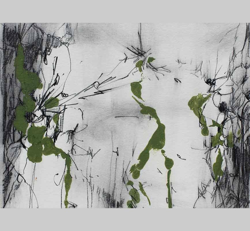
Carnival Time arrives at something genuinely festive without illustration: warm oranges pressing hard against deep blues, sweeping curves that suggest wings or petals across the paper, the pastel’s calligraphic marks joining the exuberance rather than containing it. The chromatic temperature is the performance; everything in the composition is pitched toward warmth and motion, and the paper almost seems insufficient to hold it.
Carnival Time arrives at something genuinely festive without illustration: warm oranges pressing hard against deep blues, sweeping curves that suggest wings or petals across the paper, the pastel’s calligraphic marks joining the exuberance rather than containing it. The chromatic temperature is the performance; everything in the composition is pitched toward warmth and motion, and the paper almost seems insufficient to hold it.
Petrov pushes the medium toward maximum expressiveness in Carnival Time, using transparency as a formal tool for registering force and directional energy rather than gradual tonal wash, the tradition of John Marin’s watercolors. The blues and oranges do not describe light; they enact a thermal event.
The pastel’s contribution here is less structural anchor than rhythmic instrument, laid in at speed and in multiple directions, reinforcing the composition’s overall disposition toward centrifugal energy. Looking at the painting is a bit like being inside the event it names: the eye finds no stable resting point and does not need one.